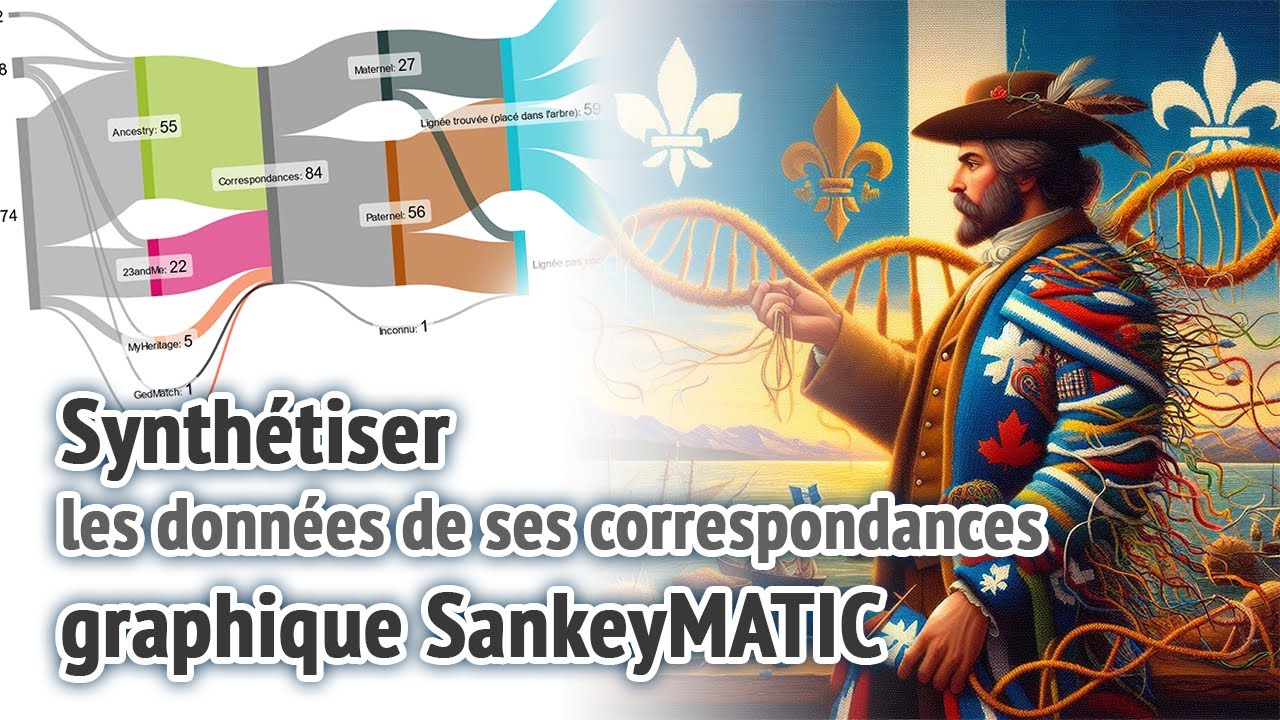
Graph Sankey pour synthétiser ses infos de matchs ADN
Sankey graph to synthesize your DNA match information
Keywords
Summary
186 words
Critical Evaluation
Value of the Information & Strength of the Argument
The video provides practical value for genealogists who want to visually summarize their DNA match data. The author demonstrates a clear workflow: first, maintain a comprehensive spreadsheet of matches, then use SankeyMATIC to create a flow diagram that highlights distribution across testing companies and paternal/maternal lines. His arguments are based on his personal case, which gives concrete examples but lacks statistical breadth. The reasoning is coherent; for instance, he explains why paternal matches are more numerous due to US emigration and double cousin scenarios, and he acknowledges that some totals appearing equal (like 59 for both limb lines and close relatives) are coincidental. He also discusses the importance of documenting matches and placing them in a family tree. However, no references to scientific studies or clinical guidelines are provided, limiting the depth of the scientific foundation.
Scientific Rigor, Source Quality, Title Accuracy
The video is a self-contained tutorial with no external references beyond the tool SankeyMATIC, whose website is inherently linked. The methodology is generally sound: the author explains his data organization (spreadsheet) and how he extracts the categories for the diagram. The title precisely describes the content, and the video stays on-topic throughout, with a logical structure (introduction, example, data explanations, creation guide). The lack of cited sources reduces the scientific rigor, but as a practical demonstration, it is acceptable. In the comments analysis, no comments were provided, so no trends can be inferred.
244 words
Title / Content Match
The title accurately reflects the content, as the video demonstrates how to use a Sankey diagram to synthesize DNA match data.
Quality & Reliability
6/10
The video is a practical tutorial based on personal experience, with clear explanations but without external scientific sources or rigorous methodological validation. The author demonstrates how to use SankeyMATIC to summarize DNA match data, which is informative but limited to a single user's case.
Chapters
Cited Sources
- SankeyMATIC — The online tool used to create the Sankey diagrams, mentioned repeatedly in the video.
Contribution & Novelties
The video offers an original application of Sankey diagrams to genetic genealogy, a domain where traditional visualizations are less common. The author demonstrates how to combine data from multiple DNA testing companies into a single flow diagram, which can help researchers understand their matches’ distribution and identify research avenues (e.g., noticing more paternal matches). This approach is practical and accessible to hobbyists.
Pour aller plus loin :
- Sankey diagram – Wikipedia — Provides background on the history and uses of Sankey diagrams.
- Genetic genealogy – Wikipedia — Explains the field and how DNA testing is used for genealogical research.
- DNA testing for ancestry – ISOGG — Offers a detailed guide on different types of DNA tests and their interpretation, relevant to the context of the video.
126 words
Radar Profile
The radar profile shows moderate scores across all dimensions, with relative strength in 'niveau_technique' (7) indicating a moderately technical tutorial, while 'fiabilite_globale' (5) reflects a lack of external sources. The overall pattern suggests a practical how-to video with acceptable but not outstanding information quality.